What does "modernize" mean when everything can be updated?
Appian's documentation site hadn't been upgraded in a decade. 40,000 users rely on it
daily.
I redesigned it in 5 weeks.
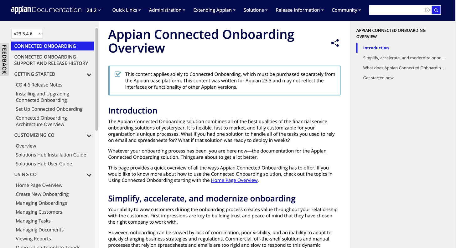
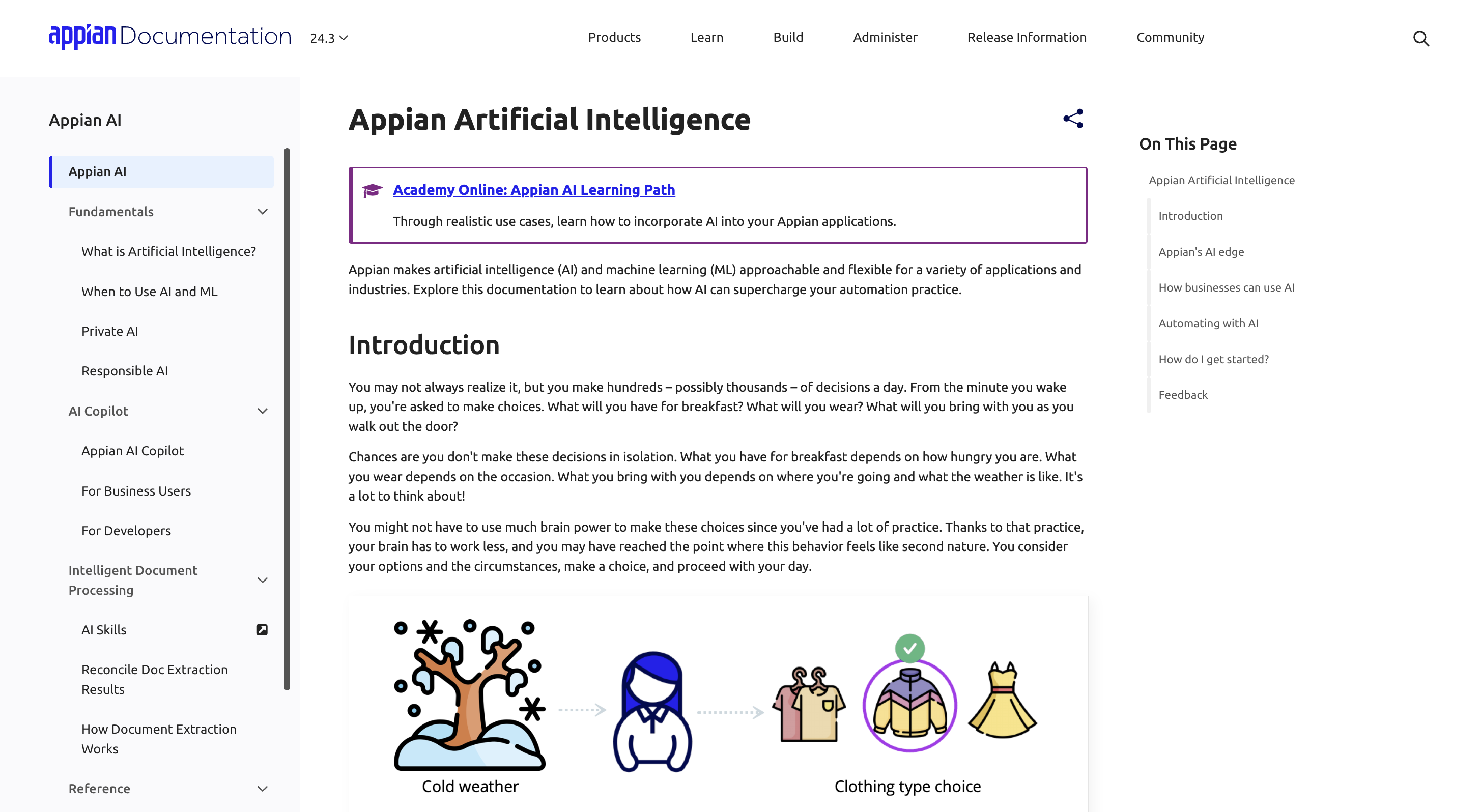
"If you don't know exactly what you're looking for on Appian Docs, you won't know where to go."
-- user survey response
You are a tech-savvy product owner. Exploring workflow automation for your team, you visit Appian Documentation to evaluate Appian's capabilities, but find it extremely difficult to navigate and overwhelming. You abandon the site, and start looking at a competitor.
You are an Appian developer in-training. You've encountered a platform error and know the solution exists somewhere in Appian Docs. You eventually find it, but only after digging through pages upon pages that give you flashbacks to early-2000s web design.
The documentation site is due for a much-needed refresh, but…
What 95% of users wanted doesn't exist
In the user survey conducted by the Docs team, 95% of users describe the "ideal docs site" as:
"like a book, with chapters and topics"
On a website, this hierarchy is reflected through breadcrumbs, a popular design pattern.
Eager to achieve the ideal user experience, I explored breadcrumb design for the site… until I noticed: the Appian Docs site does not support breadcrumbs at all.
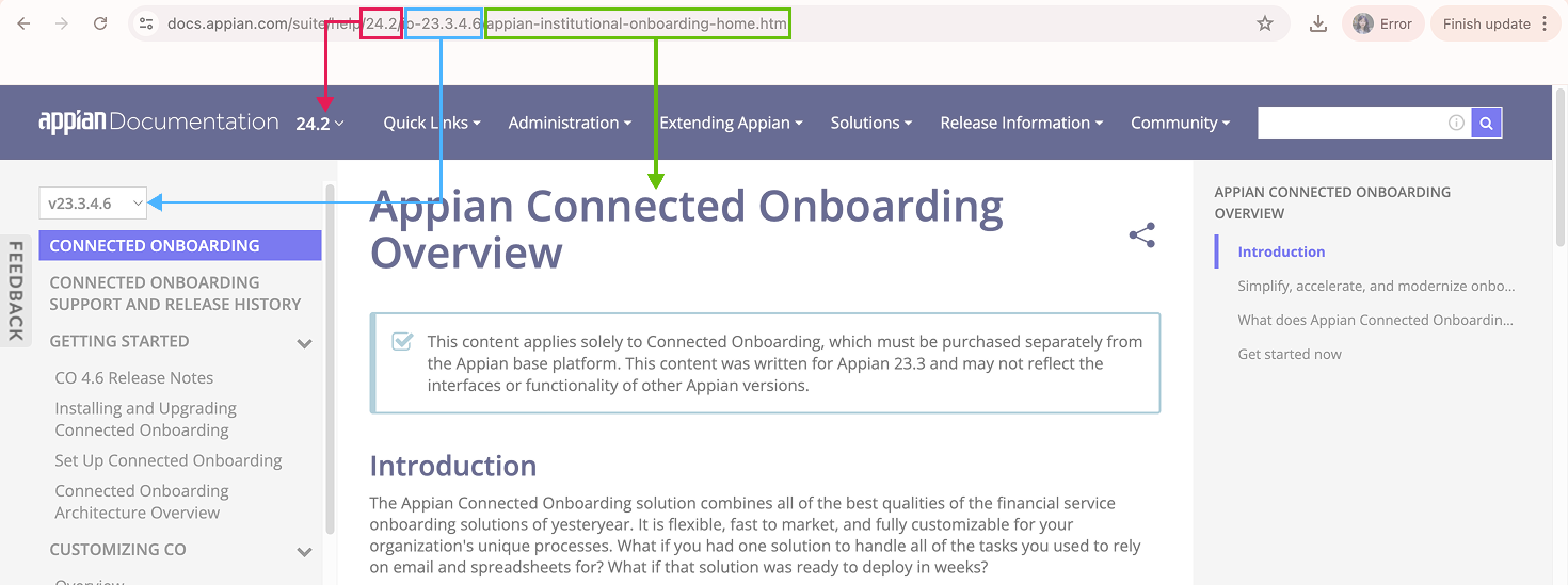
A conversation with our developer confirmed it: the site's architecture uses collections, not nested hierarchies.
I adapted and focused instead on unifying and enhancing the site's navigation experience.
Scoping under pressure
Within the structure of the internship, the project's design timeline worked out to be about 5 weeks. I had to make calls about what "done" meant before I could design anything.
I prioritized the highest-traffic components (navigation!) and scoped a phased approach for what remained.
These decisions ultimately shaped the redesign ownership: Yiwen (my fellow intern) redesigned the Docs home page — destination for newcomers of Appian, and I redesigned navigation elements, content page hierarchy, and the mobile experience.
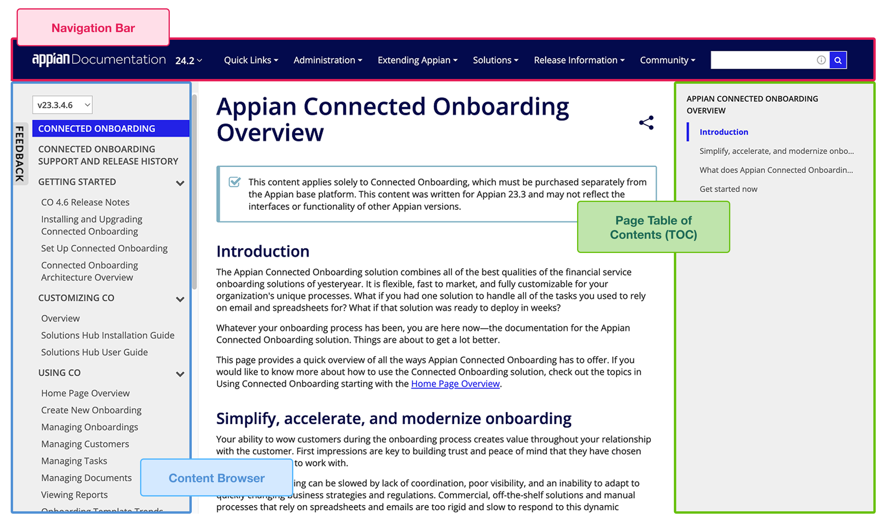
I further clarified what it means to redesign the navigation experience. With product knowledge from my PO, Google Analytics data on the site's traffic, and observation studies on how users interact with the site, I identified the highest-impact and most-used components on the site: the topmost Navigation Bar, the left-rail Content Browser, and the right-rail Page Table of Contents (TOC).
How to communicate hierarchy when the architecture won't support it?
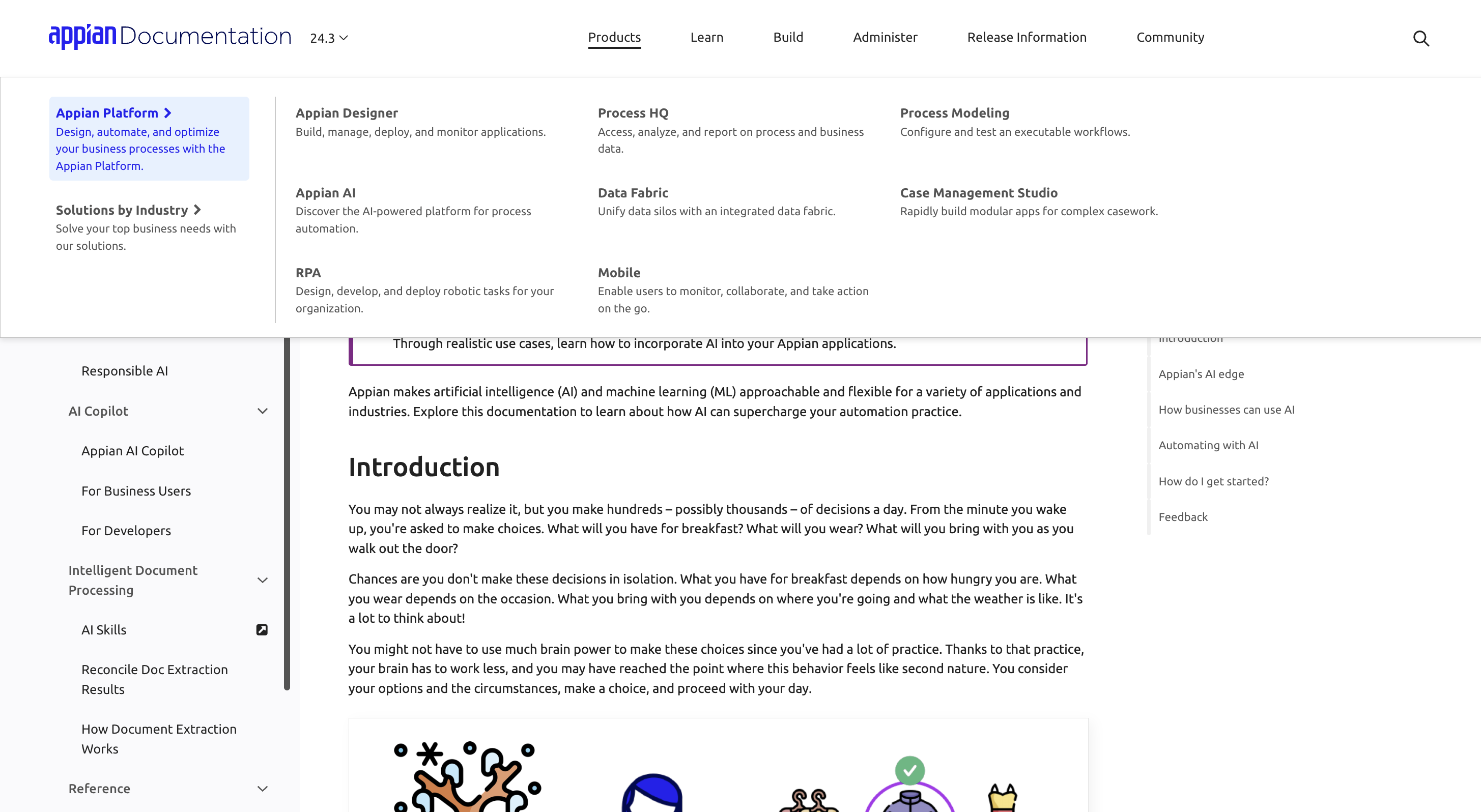
The navigation bar was the highest-traffic component on the site (second only to search), yet unoptimized. As Appian's offerings grew, the navigation grew vertically, resembling a semi-organized list rather than a map users can follow.
A review of 20+ documentation sites pointed to a consistent pattern: the most navigable sites used full-width navigation bars, grouped related content visually, and included enough context that users knew where a link would take them before clicking.
Adopting the approach, I introduced nesting levels to support future scalability without requiring architectural changes.
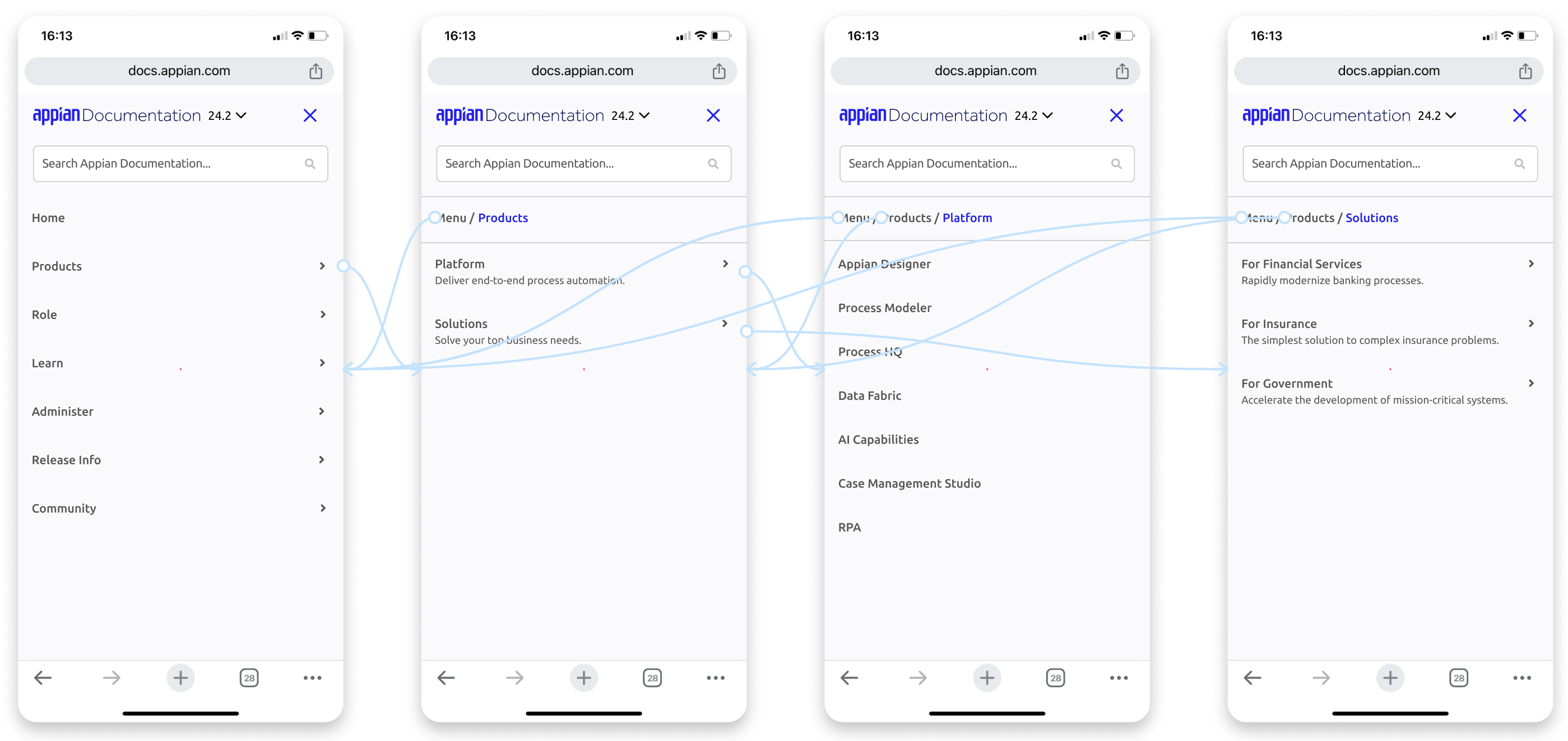
On mobile, a new problem: visible navigation items lose their parent context on smaller screens, leaving users without a sense of where they were. I added breadcrumbs to the navigation bar itself - not as a site-level hierarchy feature (which the architecture couldn't support) but as a localized orientation cue. Users always knew where they were within the menu.
For the Content Browser and Page TOC, the core issue was that users didn't understand what they did.
"I'm not sure how these [navigation rails] are different from each other, so I usually don't use them."
An audit revealed the core problem as the lack of design analogy: the UI does not suggest that the Page TOC would scroll with the page, supporting in-page navigation. I redesigned it around a scrollbar analogy, with visual behavior that signaled its purpose before users had to click anything.
User testing confirmed the redesign worked: 4 participants all recognized the Page TOC and Content Browser as serving different navigation purposes - Page TOC for within-page navigation, Content Browser for related topics.
The redesign successfully communicates the distinction the original design failed entirely.
But that was only the desktop experience. Developers use technical documentation on mobile, too. So…
Designing for mobile: supporting two different use contexts with the same design
About 15% of Appian Docs users (~20,000 people/year) access the site on mobile. But mobile users aren't just desktop users on smaller screens; their goal is different.
Mobile docs users are looking for a specific answer, perhaps under pressure, not exploring.
The content browser, which on desktop supports browsing related topics and toggling release versions, had to do the same job in a fraction of the space. I came up with 2 approaches:
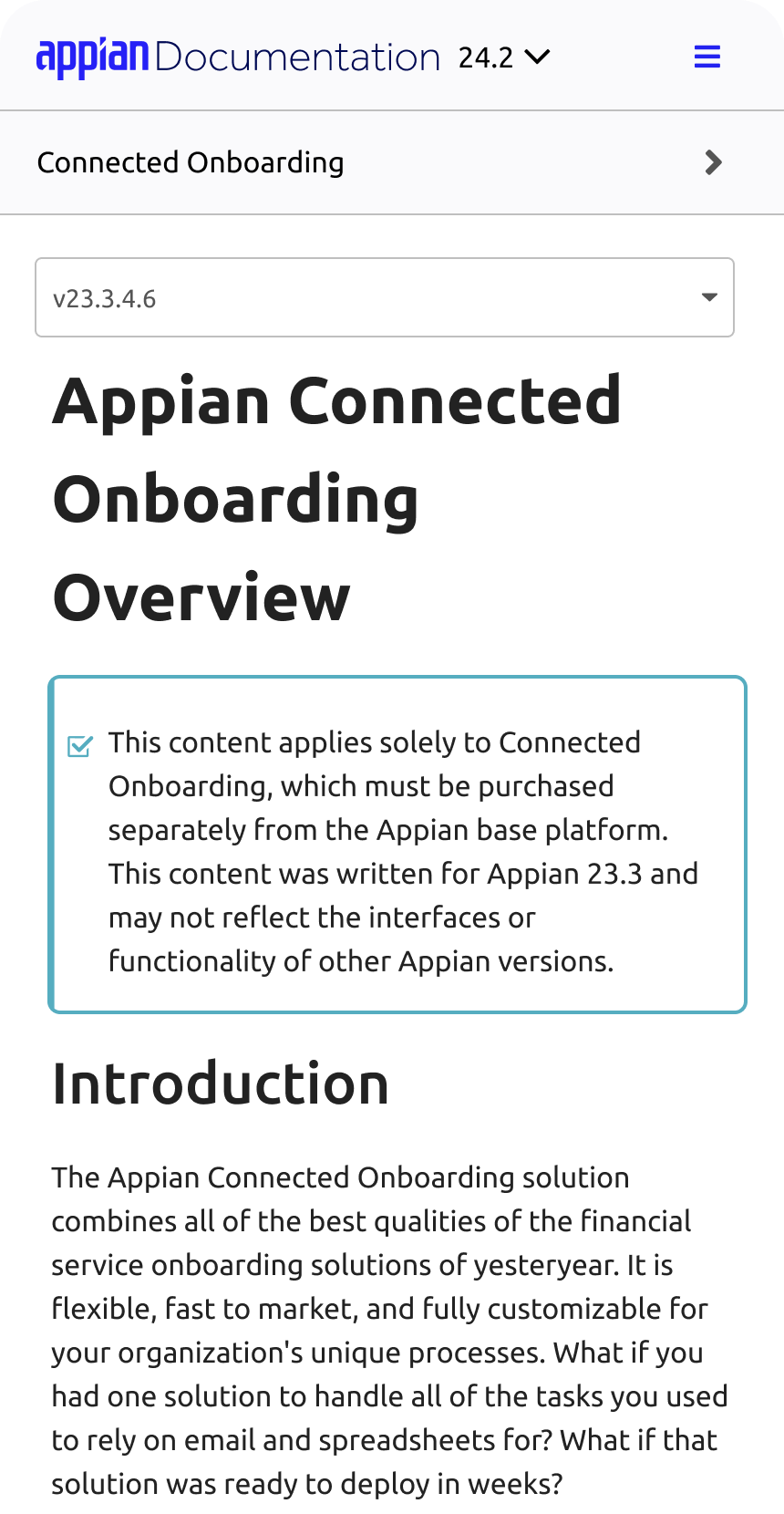
Option A uses a dropdown for toggling product versions. A familiar pattern, but it created a crowded touch target and implied the version toggle only affected the current page.
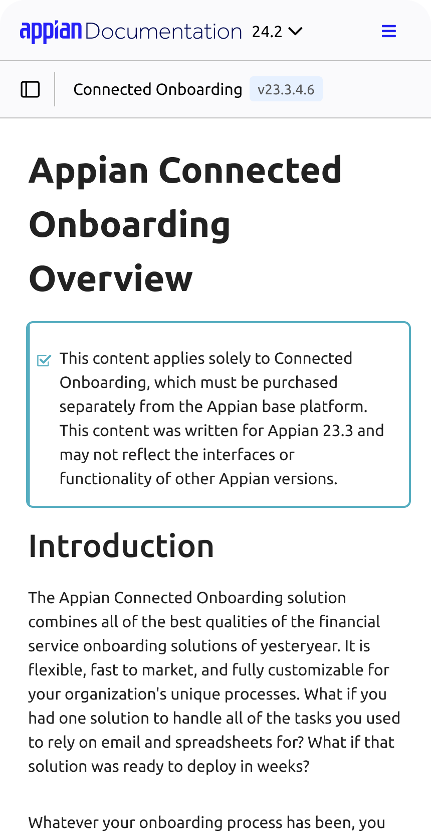
Option B uses a secondary sidebar for toggling product versions. Less common, but it communicated clearer touch targets and gave users a more accurate mental model of how version switching works across the whole product.
I conducted A/B testing with users to determine which design allows them to complete tasks most accurately (not fastest!).
Users interacting with Option A were tap-happy, but I received a lot of questions about versioning, and multiple "Didn't mean to click on that!"s. Users interacting with Option B made fewer errors and had a more accurate understanding of what the version dropdown controlled.
"I like this [Option B] more now that I've clicked on it and found out where the version dropdown is."
Option B won. The more interactive design was not the more effective one.
One more thing: when is "boring" the right answer?
The code sample is one of the most useful components on the site, yet also frustrating: the copy icon was uncommon and inconveniently placed, colors were high-contrast to the point of visual overload, and the lack of motion design creates an abrupt, unpolished experience.
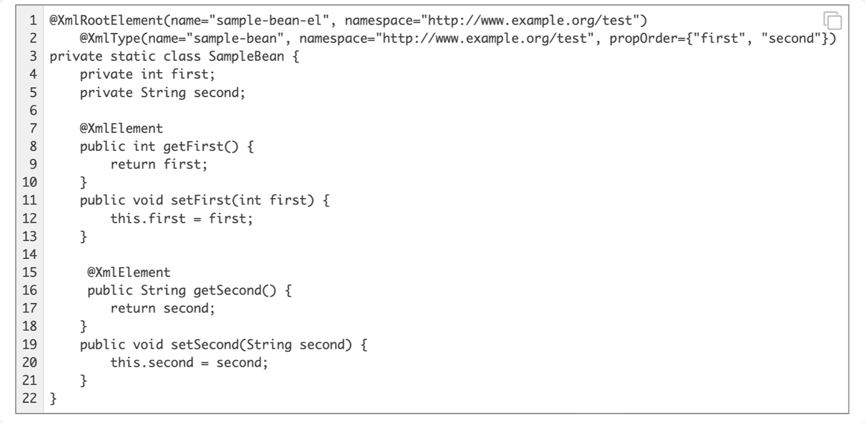
A competitive analysis of 5 documentation sites pointed toward the same pattern: utility bar above the code section, unified low-contrast color scheme, standard copy icon, subtle hover transitions.
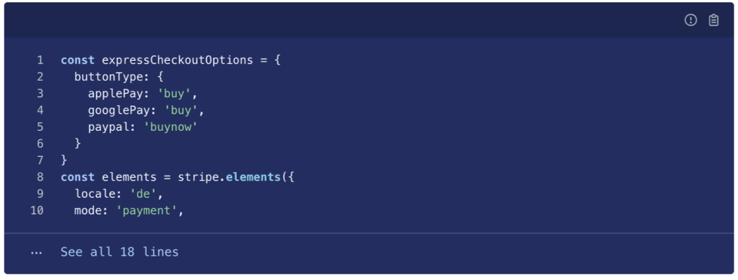
My code sample redesign follows the established pattern, because I believe that for a component users interact with constantly, invisibility — boringness — is valuable.
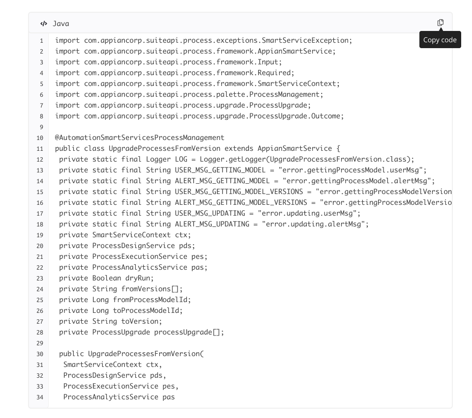
Usability testing with 4 participants confirmed it. With varying familiarity with technical documentation and programming, all found the redesigned code sample intuitive. When prompted, most found it unremarkable:
"I guess it just looks like that"
…which was precisely the point.
However, one participant who was less familiar with programming appreciated the language indicator. What seems boring to experienced users can be reassuring and user-friendly for new users. Boring can imply ease and trust.
Due to development resource constraints, the improved code sample has not yet shipped; but the rest of the redesign is live!
Explore the redesigned Appian Docs site at docs.appian.com.